Elemeno is a mobile app concept designed by five UX newbies. Despite the messy design process deviating from traditional frameworks, our project sought to tackle loneliness.
Figma
Miro
Illustrator
UX/UI Designer
Information Architecture
Testing
Research
Prototyping
Interaction Design
According to Surgeon General Dr. Vivek, there is a loneliness epidemic in America. He concludes, maintaining quality time is important for staying healthy.
Are you tired of having the same plans every weekend? Have you ever had trouble making plans with a friend? Either your schedules don't align or neither of you can make a decision. Have you ever had to plan a company outing, but had no clue where to bring your co-workers? What if there was a tool that did all the planning and research for you?
Task: Create a product to plan quick and easy quality time for busy people.

Our solution is a mobile app called Elemeno that makes planning events easy. This app offers a variety of accessible ideas, perfect for people who don't usually plan ahead or prefer spontaneous activities.
Elemeno helps by suggesting random activities based on letters, making it simple to find fun things to do and strengthen relationships.
%20(1).gif)
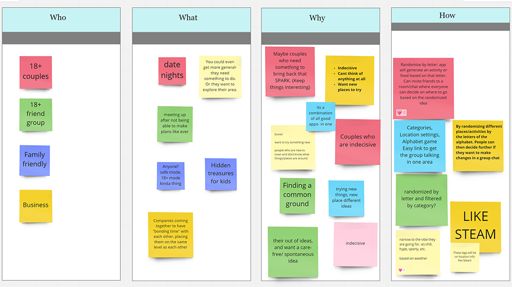
To begin our project, our team brainstormed different types of users and situations to show how our app can help people strengthen their personal connections. We explored various reasons why someone might want to use our app to improve their relationships.
Outlining their needs helped us enhance the app's filter feature, which allows various groups with different needs to get personalized results.
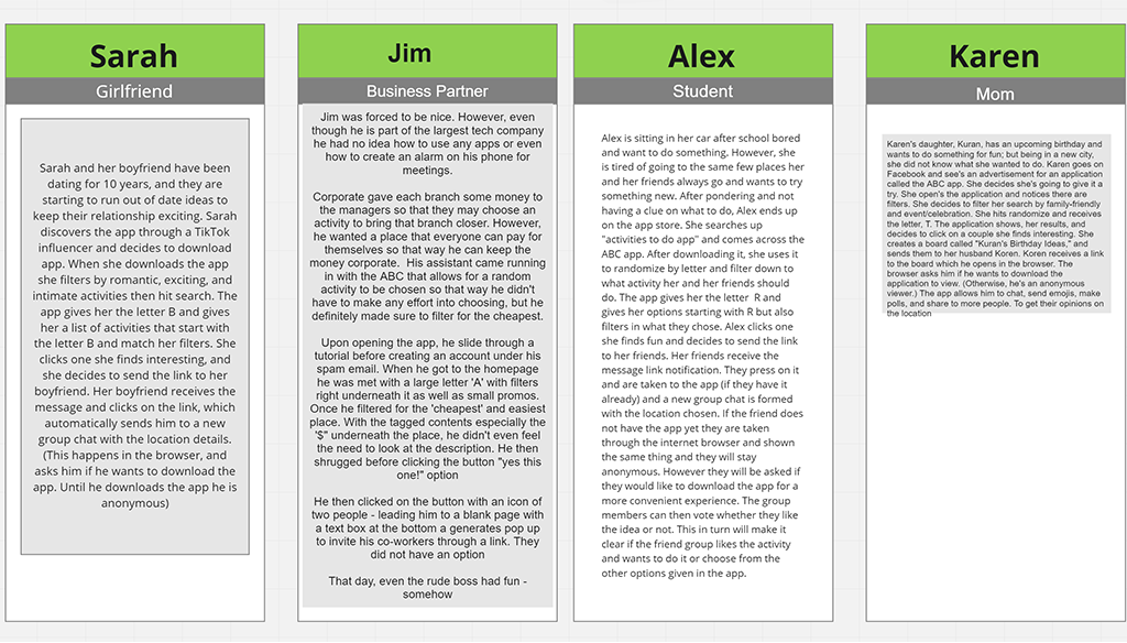
These user stories gave us insight into different user journeys, helping us determine which features needed greater visibility in our prototype designs.
The paradox of choice reveals an abundance of options creates unnecessary cognitive load and dissatisfaction for consumers.
In a study by Iyengar and Lepper, when shoppers "were presented with just six options, 30% of people made a purchase, compared to just 3% who made a decision when confronted with 24 options" (Franssen, 2017). In a similar study by Proctor and Gambel, researchers found that decreasing the available choice of any given product leads to a 10% revenue increase (Franssen, 2017).
This statistic motivated us to create an app that limits idea output, but still lets users feel free to choose what they want.

When we looked at what our competitors were doing, we made an important discovery: many of them give too many suggestions, which can overwhelm users. After careful research and studying the issue, we can assume these designs don't help users with decision making.
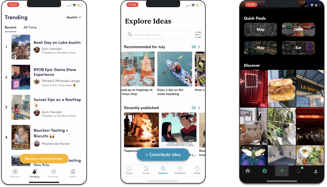
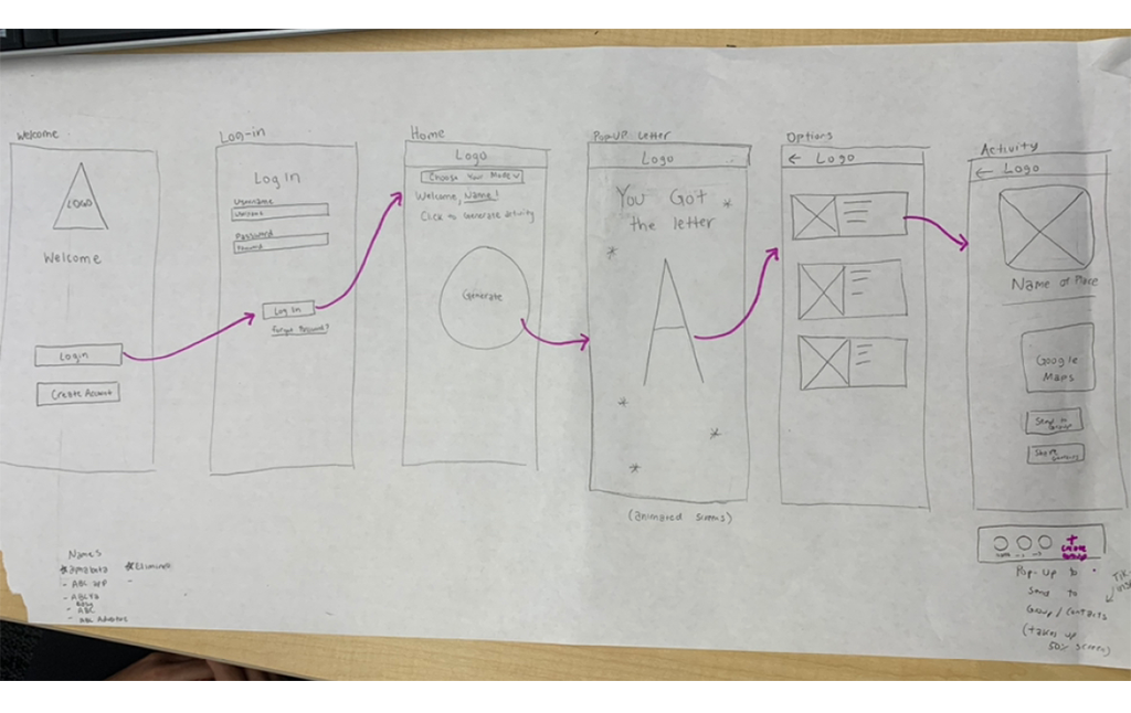
Before jumping into Figma, our team mapped out a structure to identify key features and a list of essential elements. The features were inspired by the insights collected from our competitors and their user reviews.
Some key features include:
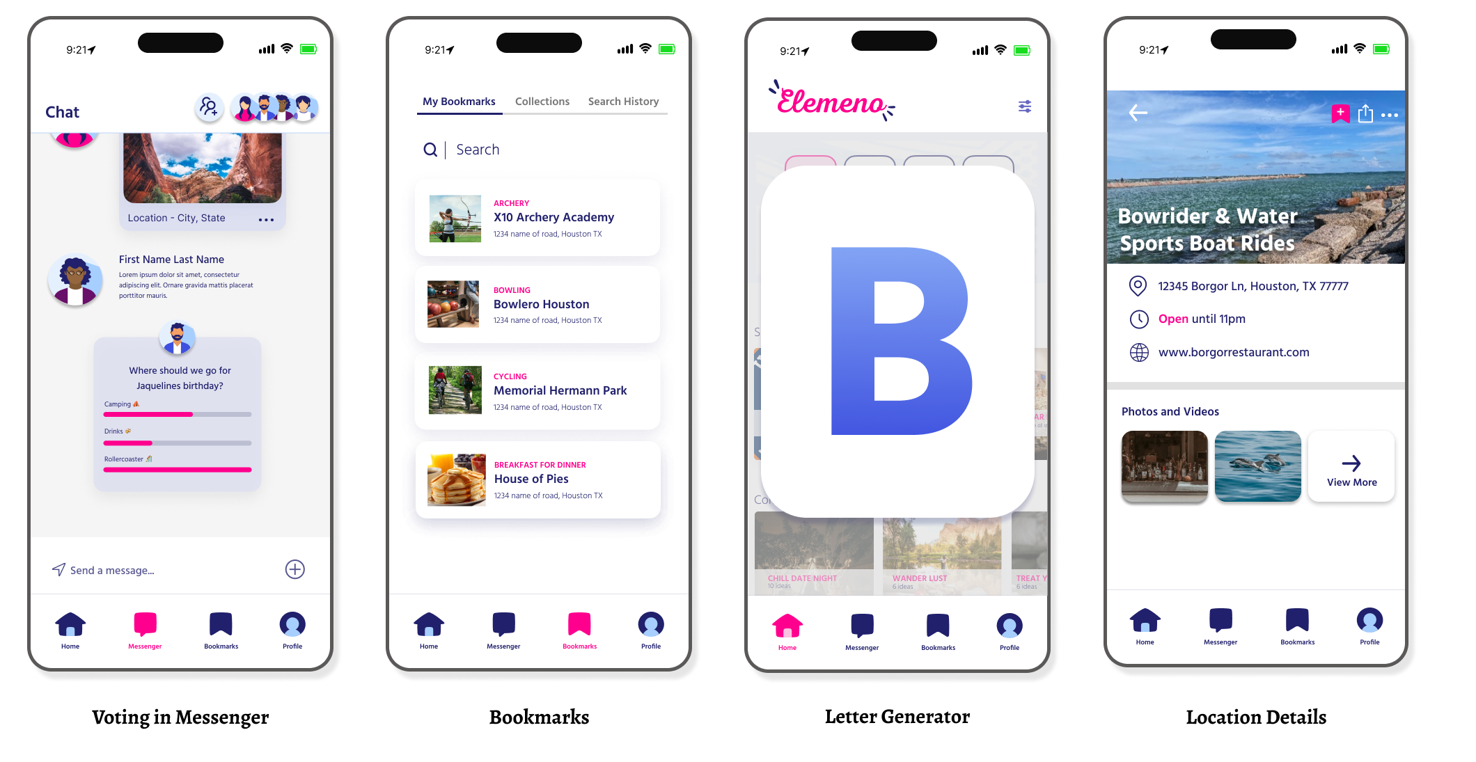
We tested on ten (10) users to identify areas of improvement before moving into the high-fidelity concept.

We organized our testers based on four different types of users, assigning two testers to each type and adding an extra tester to the groups focused on relationships and friends, making a total of ten testers. These testers had to complete ten tasks that matched the main features of our app.
After finishing these tasks, they gave us feedback by filling out a form called the System Usability Scale (SUS). Testing this way helped us identify problems and gave us ideas on how to improve the app.
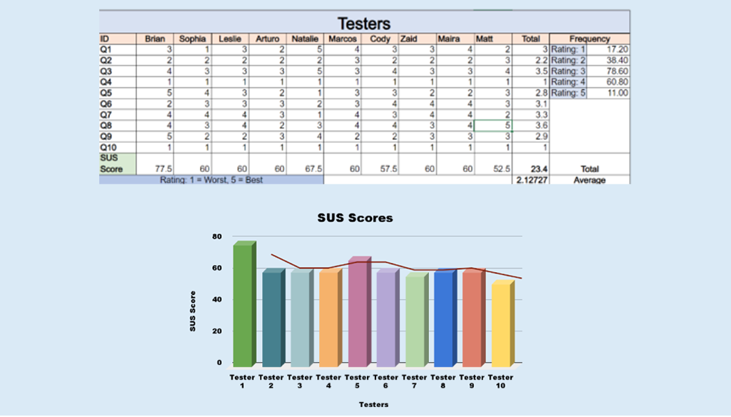
User testing showed us several problems, especially with preventing mistakes and making the app more flexible. To fix these issues, I redesigned the way information is organized in the app. I improved the home page and added a feature to keep track of your search history.
.jpg)
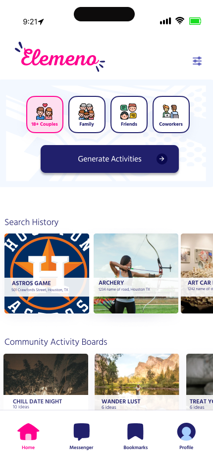


Elemeno is a mobile app concept designed to help couples break out of their routine and ease decision-making. We noticed that many couples struggle with the question, "What do you want to do?" By studying consumer behavior, we discovered fewer options help decision-making. We decided to incorporate this insight into our concept.
Teammates were new to Figma and visual design. However, we overcame this hurdle by conducting user testing, which helped us identify initial design flaws.
As the main designer for how information is organized in this app, I discovered how much the layout of a page can affect how users think and their interest in buying a product. By really understanding what users needed, our team was able to design a concept that people were excited to use. During our interviews, many people showed interest in the product and even wanted to help develop it further.
.png)
